Level 2
The bar graph shows the number of students in each class. How many more students are in Class D than in Class C? Express it as a percentage of the total number of students in all the classes.
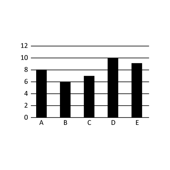
Level 2
The bar graph shows the number of students in each class. How many more students are in Class D than in Class C? Express it as a percentage of the total number of students in all the classes.
Level 1
The bar graph shows the average daily temperature experienced by Country A in a week. What was the difference in the highest and lowest average daily temperatures in that week?
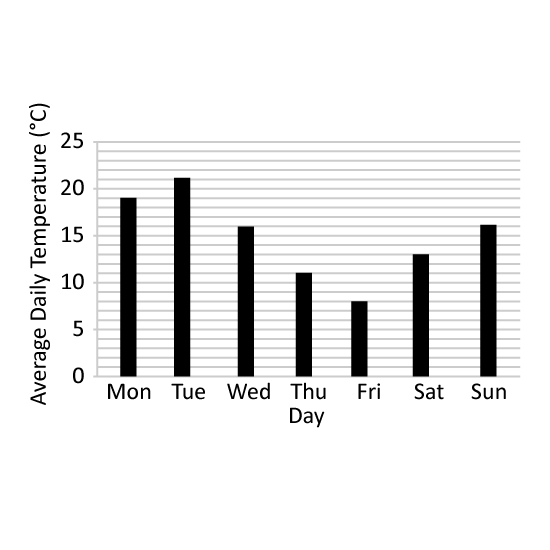
Level 1
The bar graph shows the average daily temperature experienced by Country A in a week. What was the difference in the highest and lowest average daily temperatures in that week?
Level 2
The bar graph shows the number of patients visiting a clinic during a period of time. The average number of patients visiting the clinic is 8 patients per hour.
Which date is most probably a Sunday?
What is the total number of patients visiting the clinic from 8 October to 12 October?
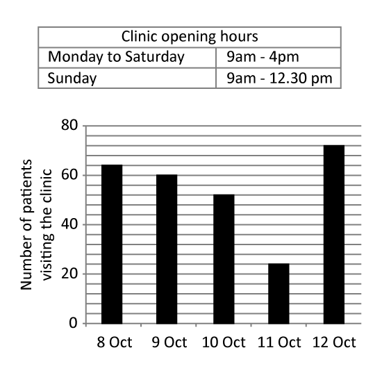
Level 2
The bar graph shows the number of patients visiting a clinic during a period of time. The average number of patients visiting the clinic is 8 patients per hour.
Which date is most probably a Sunday?
What is the total number of patients visiting the clinic from 8 October to 12 October?
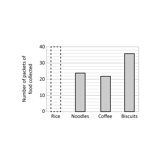
Level 2
The bar graph shows the number of packets of different food collected in a donation drive.
15 of the total number of packets of food collected was coffee. How many packets of rice were collected?
The table shows the mass of each packet of food. What is the difference between the total mass of noodles collected and the total mass of biscuits collected? Give your answer in kg.
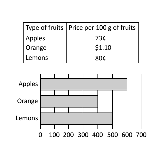