Level 2 PSLE
A group of boys were asked to choose their favourite sport from swimming, basketball and football. The pie chart represents the boys choices. Half of the group chose football.
  1. What percentage of the group chose swimming?
  2. The boys' choices were also represented by a bar graph. Part of the graph had been torn off. How many boys chose basketball?
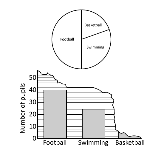
2 m
Level 2
The line graph shows the temperature at different times of a day in a city.
  1. At what time was the temperature of the city the highest?
  2. During which 2-hour interval did the temperature decrease by 6°C?
3 m
Level 2
The line graph shows the number of zoo tickets sold from Tuesday to Saturday.
  1. What is the difference between the highest and the lowest number of zoo tickets sold from Tuesday to Saturday?
  2. Between which 2 days did the number of tickets sold increase the greatest? Give your answer in the following format. (Eg Mon to Tue)
3 m
Level 2
The graph shows the number of burgers sold by a fast-food restaurant in a week.
  1. Which day showed a decrease in the number of burgers sold compared to the previous day?
  2. Each burger was sold at $4 each. How much money did the restaurant earn from the total sales on Saturday and Sunday?
3 m
Level 2
The graph shows the number of cars sold by Mr Lee from March to July.
  1. How many cars did Mr Lee sell from May to July?
  2. Mr Lee sold 19 fewer cars in February than in March, how many cars did he sell in February?
3 m