Level 2
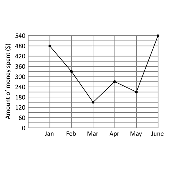
The line graph shows the amount of money Joseph spent from January to June.
  1. Of the amount Joseph spent in February, $138 was spent on clothes and the remaining amount was spent on food. How much did he spend on food in February?
  2. In which month did Joseph spend $120 more than the previous month? Give your answer in this format. (Eg Jan)
3 m
Level 2
The line graph shows survey results of the favourite snacks of some children.
  1. How many children took part in the survey?
  2. Which 2 snacks have the same total number of votes as popcorn and candy? Give your answers in numbers. (Eg 1, 2)
3 m
Level 2
The line graph shows the number of chicken wings sold from Monday to Sunday.
  1. On which two days are the increase/decrease the same from their previous day? Answer in short form eg Mon, Tue.
  2. If each chicken wing was sold at $1.20, what was the total amount of money collected on the day with the least sale?
3 m
Level 2
The line graph shows the sale of different types of ice cream in a store in a day.
  1. Which is the most popular type of ice cream? Give the first letter of the answer. (Eg Apple = A)
  2. What is the difference in sales between the most popular and the least popular type of ice cream?
  3. What was the total amount collected from the sale of the ice creams in the day?
3 m
Level 2
The graph shows the income George made when he worked as a banker from January to May.
  1. What was the difference between the highest and lowest income earned by George?
  2. Between which two months was the decrease in George's income the greatest? Give the answer in short form. (Eg Jan, Feb)
3 m