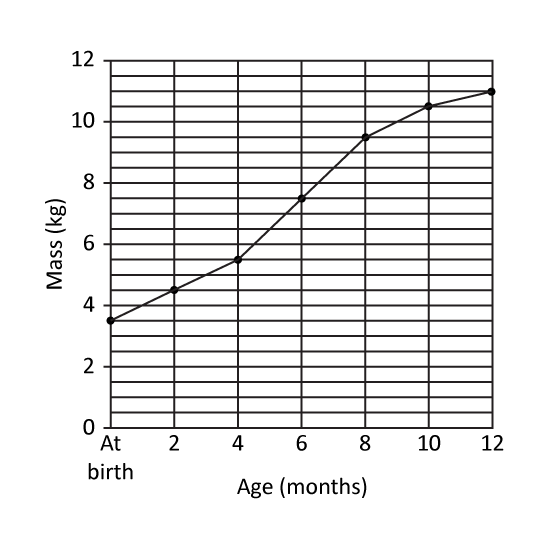
Level 1 PSLE
The line graph shows Kenneth's mass from birth to his first birthday. At what age was Kenneth's mass 3 times his mass at birth? _____ months
Level 1 PSLE
The line graph shows Kenneth's mass from birth to his first birthday. At what age was Kenneth's mass 3 times his mass at birth? _____ months
Image in this question is not available.
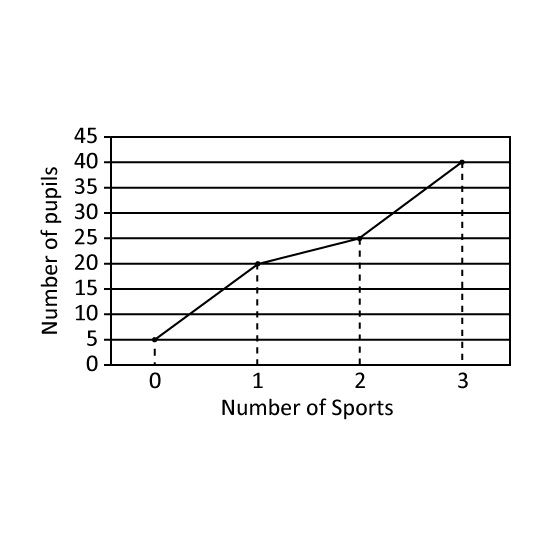
Level 1
The graph shows the number of sports that a group of pupils participated in. How many pupils participated in at least 1 sport?
Level 1
The graph shows the number of sports that a group of pupils participated in. How many pupils participated in at least 1 sport?
Image in this question is not available.
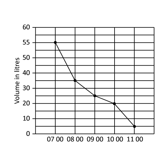
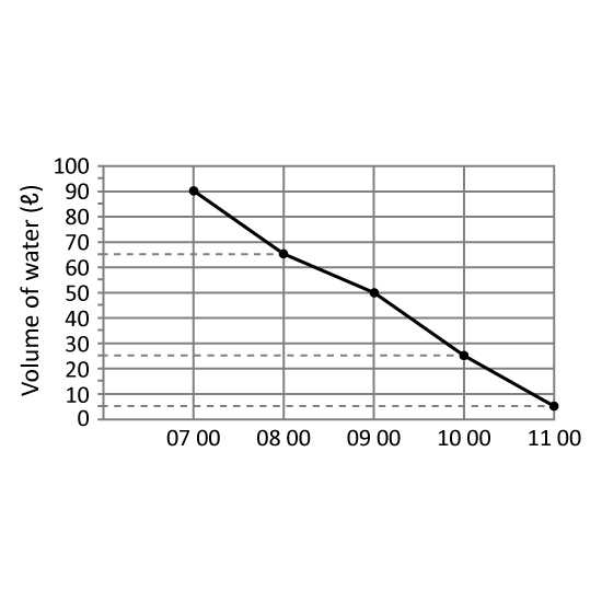
Level 1 PSLE
A tank was filled with 55 litre of water at 07 00. Water flowed out of the tank from 07 00 to 11 00. The line graph shows the amount of water in the tank from 07 00 to 11 00.
During which one-hour period was the decrease in the volume of water the greatest?
Give your answer in number. (Eg 1)
(1) From 0700 to 0800
(2) From 0700 to 0900
(3) From 0900 to 1000
(4) From 1000 to 1100
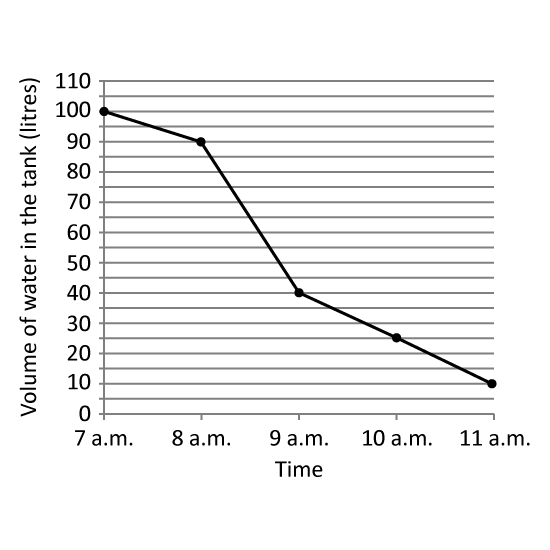
Image in this question is not available.
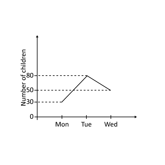
Level 1 PSLE
The graph shows the number of children at the camp from Monday to Wednesday. The number of children at a club increased by (a) _____ from Monday to Tuesday and decreased by (b) _____ from Tuesday to Wednesday.
Level 1 PSLE
The graph shows the number of children at the camp from Monday to Wednesday. The number of children at a club increased by (a) _____ from Monday to Tuesday and decreased by (b) _____ from Tuesday to Wednesday.
Image in this question is not available.
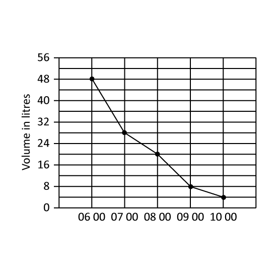
Level 1 PSLE
A tank was filled with 48 litres of water at 06 00. Water flowed out of the tank from 06 00 to 11 00. The line graph shows the amount of water in the tank from 06 00 to 10 00. What was the average decrease in the volume of water in litres per hour from 06 00 to 10 00? (Give your answer in ℓ.)
Image in this question is not available.
Level 1
The line graph shows the amount of utility bills paid by Mr Gann's household in the first six months of the year. In which month did the greatest decrease in utility bills occur? Give the answer in short form. (Eg Jan)
Level 1
The line graph shows the amount of utility bills paid by Mr Gann's household in the first six months of the year. In which month did the greatest decrease in utility bills occur? Give the answer in short form. (Eg Jan)
Image in this question is not available.
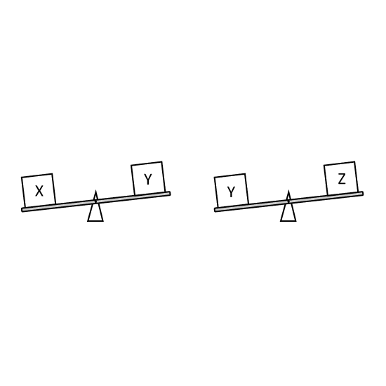
Level 2
Robert was comparing the mass of 3 boxes as shown . If you will make a line graph for this, which box is at the highest point? Express your answer as the letter of the correct box.
Level 2
Robert was comparing the mass of 3 boxes as shown . If you will make a line graph for this, which box is at the highest point? Express your answer as the letter of the correct box.
Image in this question is not available.
Level 2
A tank was filled with 90 ℓ of water at 07 00. Water flowed out of the tank from 07 00 to 11 00. The line graph shows the amount of water in the tank from 07 00 to 11 00. Which one-hour period shows the least decrease in the amount of water in the tank? Give your answer in this format. (Eg 12 00 to 13 00)
Image in this question is not available.
Level 2
A tank was completely filled with water at 7 a.m Water flowed out of the tank from 7 a.m. to 11 a.m. The line graph shows the volume of water in the tank at each 1-hour interval from 7 a.m. to 11 a.m. At what time was 14 of the tank filled with water?
Level 2
A tank was completely filled with water at 7 a.m Water flowed out of the tank from 7 a.m. to 11 a.m. The line graph shows the volume of water in the tank at each 1-hour interval from 7 a.m. to 11 a.m. At what time was 14 of the tank filled with water?
Image in this question is not available.
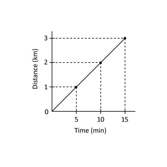
Level 2 PSLE Bryan cycles at a constant speed from home to work. The graph shows the distance Bryan cycles for the first 15 minutes.
The distance between Bryan's home and work is 7.5 km.
- How many minutes does Bryan take to cycle from home to work?
- What is Bryan's cycling speed in km/h?
Level 2 PSLE Bryan cycles at a constant speed from home to work. The graph shows the distance Bryan cycles for the first 15 minutes.
The distance between Bryan's home and work is 7.5 km.
- How many minutes does Bryan take to cycle from home to work?
- What is Bryan's cycling speed in km/h?
Image in this question is not available.
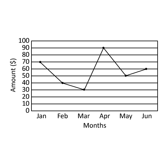
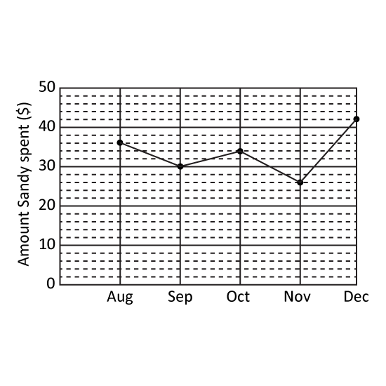
Level 1 PSLE
Sandy received $70 from his father each month for her allowance. The line graph shows the amount of allowance she spent each month.
-
What is the difference between the amounts Sandy spent in October and in December?
-
Write down all the months in which Sandy spent more than half her allowance. Give the answer in short form. (Eg Jan, Mar)
Image in this question is not available.
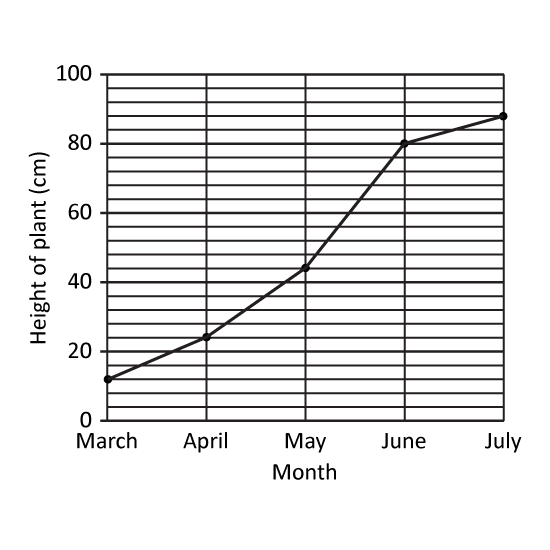
Level 1 PSLE
The graph shows the height of a plant from January to May.
- What was the height of the plant in March?
- During which period did the plant grow the most? Give your answer in numbers. (Eg Jan to Feb = 1 to 2)
Level 1 PSLE
The graph shows the height of a plant from January to May.
- What was the height of the plant in March?
- During which period did the plant grow the most? Give your answer in numbers. (Eg Jan to Feb = 1 to 2)
Image in this question is not available.
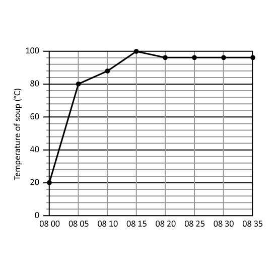
Level 1 PSLE
The line graph shows the temperature of soup in a pot from 08 00 to 08 35. (Give your answers in °C.)
- What was the temperature of the soup at 08 25?
- What was the increase in temperature per minute over the first 5 minutes?
Level 1 PSLE
The line graph shows the temperature of soup in a pot from 08 00 to 08 35. (Give your answers in °C.)
- What was the temperature of the soup at 08 25?
- What was the increase in temperature per minute over the first 5 minutes?
Image in this question is not available.
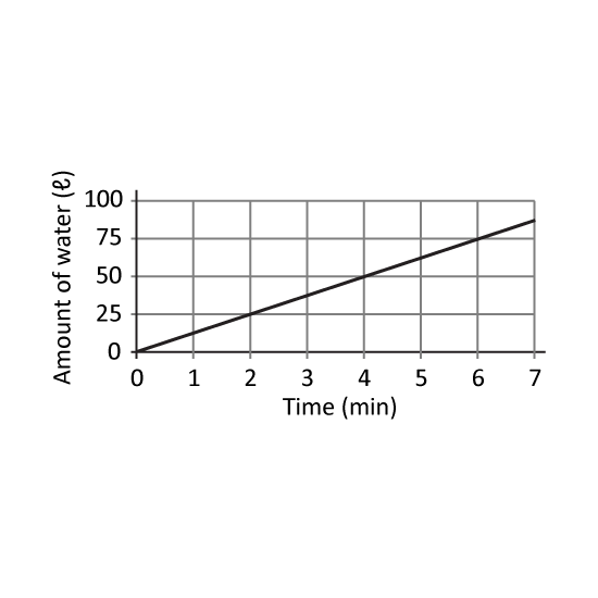
Level 2 PSLE
The graph shows the amount of water that flows from a tap. At this rate, how many litres will flow from the tap in 28 minutes?
Level 2 PSLE
The graph shows the amount of water that flows from a tap. At this rate, how many litres will flow from the tap in 28 minutes?
Image in this question is not available.
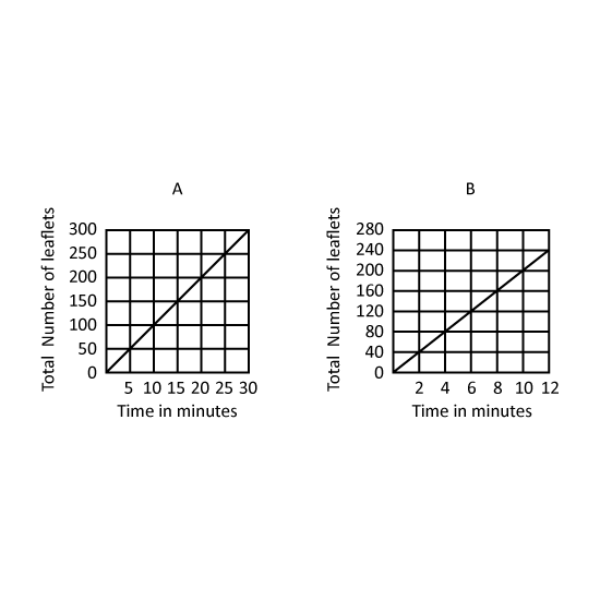
Level 3 PSLE The graphs show the total number of leaflets machines A and B printed from the start. Both machines started printing at the same time.
- How many more leaflets did B print than A in 5 minutes?
- Both machines did not change their rates of printing throughout. When A had printed 200 leaflets, how many leaflets had B printed?
Image in this question is not available.
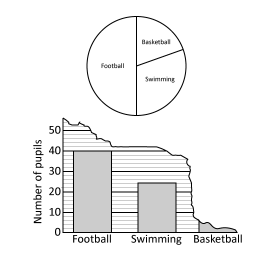
Level 2 PSLE
A group of boys were asked to choose their favourite sport from swimming, basketball and football. The pie chart represents the boys choices. Half of the group chose football.
- What percentage of the group chose swimming?
- The boys' choices were also represented by a bar graph. Part of the graph had been torn off. How many boys chose basketball?
Image in this question is not available.
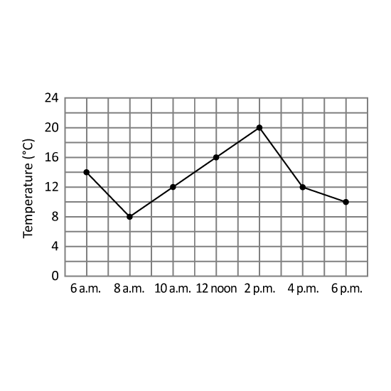
Level 2
The line graph shows the temperature at different times of a day in a city.
- At what time was the temperature of the city the highest?
- During which 2-hour interval did the temperature decrease by 6°C?
Level 2
The line graph shows the temperature at different times of a day in a city.
- At what time was the temperature of the city the highest?
- During which 2-hour interval did the temperature decrease by 6°C?
Image in this question is not available.
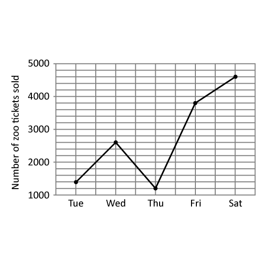
Level 2
The line graph shows the number of zoo tickets sold from Tuesday to Saturday.
- What is the difference between the highest and the lowest number of zoo tickets sold from Tuesday to Saturday?
- Between which 2 days did the number of tickets sold increase the greatest? Give your answer in the following format. (Eg Mon to Tue)
Image in this question is not available.
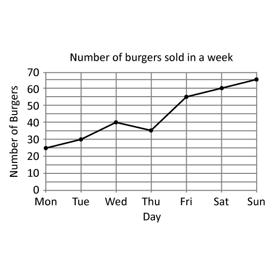
Level 2
The graph shows the number of burgers sold by a fast-food restaurant in a week.
- Which day showed a decrease in the number of burgers sold compared to the previous day?
- Each burger was sold at $4 each. How much money did the restaurant earn from the total sales on Saturday and Sunday?
Level 2
The graph shows the number of burgers sold by a fast-food restaurant in a week.
- Which day showed a decrease in the number of burgers sold compared to the previous day?
- Each burger was sold at $4 each. How much money did the restaurant earn from the total sales on Saturday and Sunday?
Image in this question is not available.
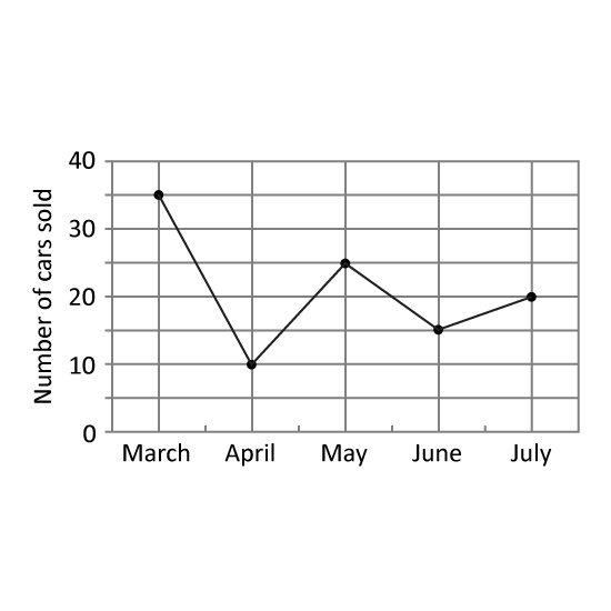
Level 2
The graph shows the number of cars sold by Mr Lee from March to July.
- How many cars did Mr Lee sell from May to July?
- Mr Lee sold 19 fewer cars in February than in March, how many cars did he sell in February?
Level 2
The graph shows the number of cars sold by Mr Lee from March to July.
- How many cars did Mr Lee sell from May to July?
- Mr Lee sold 19 fewer cars in February than in March, how many cars did he sell in February?
Image in this question is not available.