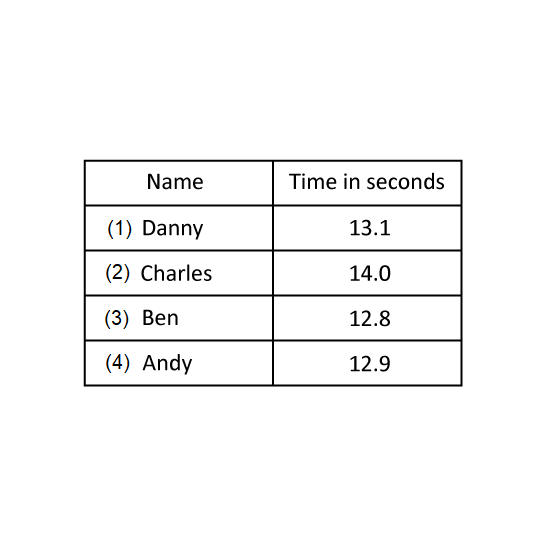
Level 2 PSLE
The table shows the number of pupils with the following scores. A higher score means a better performance. Prizes were given to the top 8 pupils. Aaron won a prize. What was the lowest he could have scored?
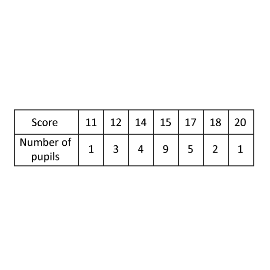
Level 2 PSLE
The table shows the number of pupils with the following scores. A higher score means a better performance. Prizes were given to the top 8 pupils. Aaron won a prize. What was the lowest he could have scored?
Level 2 PSLE
Participants of a quiz must obtain at least a certain score in the first round to qualify for the next round. There were 150 participants in the first round and the table shows the number of participants for each score. 50% of the participants did not qualify for the next round. From the table, what was the lowest score of a participant who qualified for the next round?
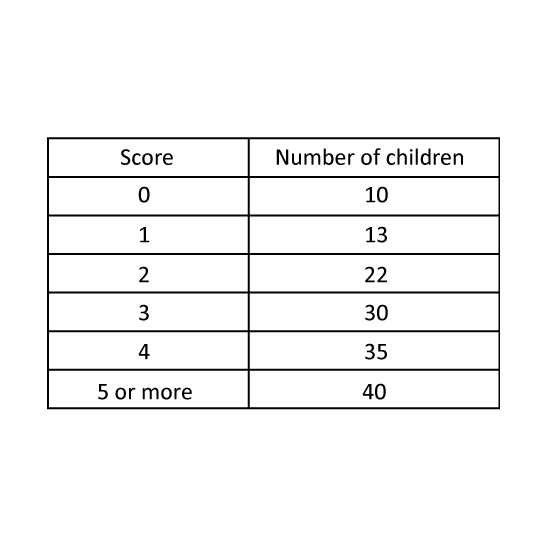
Level 2 PSLE
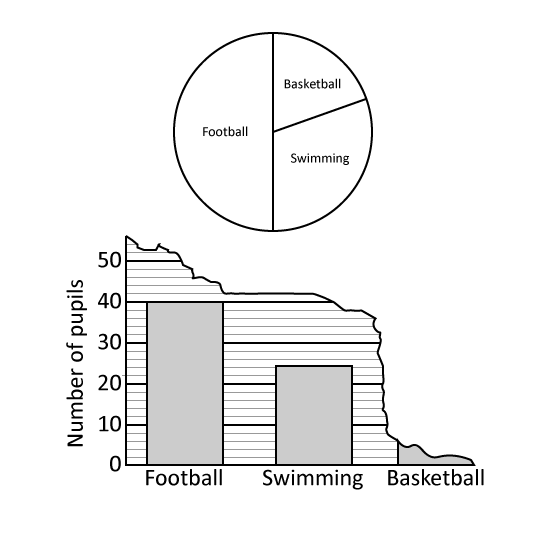
A group of boys were asked to choose their favourite sport from swimming, basketball and football. The pie chart represents the boys choices. Half of the group chose football.
What percentage of the group chose swimming?
The boys' choices were also represented by a bar graph. Part of the graph had been torn off. How many boys chose basketball?
Level 2 PSLE
A group of boys were asked to choose their favourite sport from swimming, basketball and football. The pie chart represents the boys choices. Half of the group chose football.
What percentage of the group chose swimming?
The boys' choices were also represented by a bar graph. Part of the graph had been torn off. How many boys chose basketball?
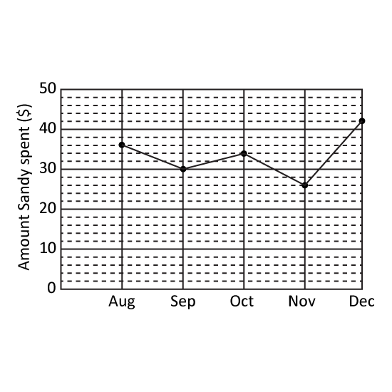
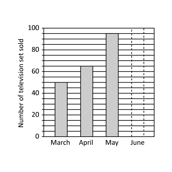
Level 2 PSLE
The graph shows the number of television sets sold from March to June. The number of television sets sold in June is equal to the average number of television sets sold from March to May. Find the number of television sets sold in June.
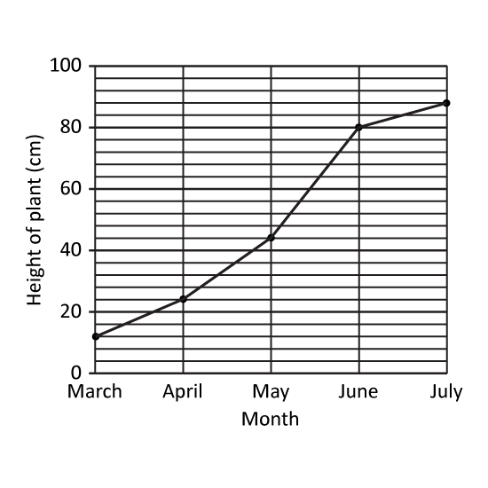
Level 2 PSLE
The graph shows the number of television sets sold from March to June. The number of television sets sold in June is equal to the average number of television sets sold from March to May. Find the number of television sets sold in June.