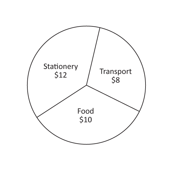
Level 1 PSLE
The pie chart shows how John spent the money his mother gave him. What fraction of the money did he spend on food?
Level 1 PSLE
The pie chart shows how John spent the money his mother gave him. What fraction of the money did he spend on food?
Image in this question is not available.
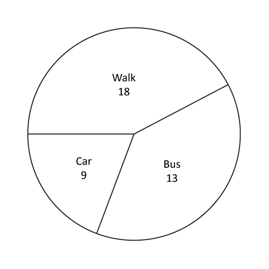
Level 1 PSLE
The pie chart shows how a class of 40 students go to school. What percentage of the class walk to school?
Level 1 PSLE
The pie chart shows how a class of 40 students go to school. What percentage of the class walk to school?
Image in this question is not available.
Level 1 PSLE
A group of 200 pupils was asked to name their favourite sports. The pie chart shows their choices and the number of pupils who chose each of the sports. Which sports was chosen by 25% of the pupils? Give the answer in letter.
Level 1 PSLE
A group of 200 pupils was asked to name their favourite sports. The pie chart shows their choices and the number of pupils who chose each of the sports. Which sports was chosen by 25% of the pupils? Give the answer in letter.
Image in this question is not available.
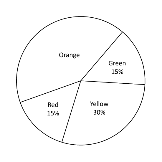
Level 1 PSLE
The pie chart shows the favourite colours of a group of pupils. What percentage of the pupils choose orange as their favourite colour?
Level 1 PSLE
The pie chart shows the favourite colours of a group of pupils. What percentage of the pupils choose orange as their favourite colour?
Image in this question is not available.
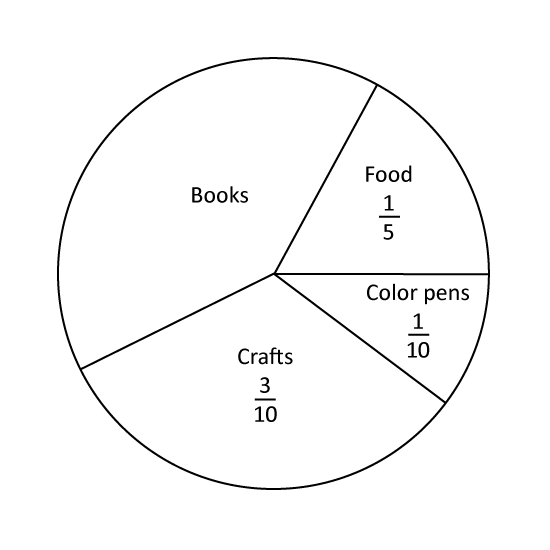
Level 1 PSLE
The pie chart shows how Jenny spent her pocket money last month. What is the ratio of the amount of money Jenny spent on crafts to the amount she spent on books?
Level 1 PSLE
The pie chart shows how Jenny spent her pocket money last month. What is the ratio of the amount of money Jenny spent on crafts to the amount she spent on books?
Image in this question is not available.
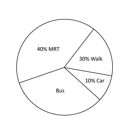
Level 1 PSLE
The pie chart shows the different ways a group of workers go to work. What is the ratio of number of workers who walk to work to the number who go by bus?
Level 1 PSLE
The pie chart shows the different ways a group of workers go to work. What is the ratio of number of workers who walk to work to the number who go by bus?
Image in this question is not available.
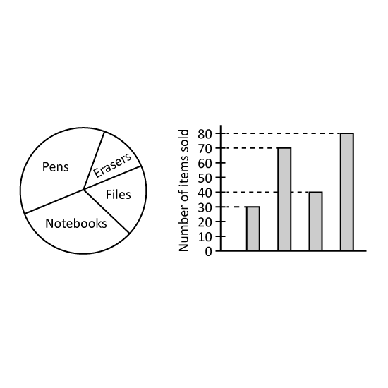
Level 2 PSLE
The pie chart shows the number of pens, erasers, file and notebook sold by a shop. The same information is shown in a bar graph, but the names of the items are not shown on the bar graph.
How many less erasers than pens are sold?
Level 2 PSLE
The pie chart shows the number of pens, erasers, file and notebook sold by a shop. The same information is shown in a bar graph, but the names of the items are not shown on the bar graph.
How many less erasers than pens are sold?
Image in this question is not available.
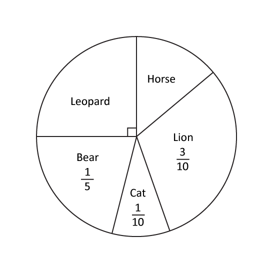
Level 1 PSLE
In a class, each pupil chose one animal for their class banner. The pie chart shows their choices. What fraction of the class chose Horse?
Level 1 PSLE
In a class, each pupil chose one animal for their class banner. The pie chart shows their choices. What fraction of the class chose Horse?
Image in this question is not available.
Level 2
The pie chart shows the number of three types of files sold by a bookstore last week. Which bar graph best represents the information in the pie chart? Give your answer in number. (Eg 1)
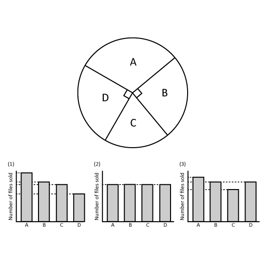
Level 2
The pie chart shows the number of three types of files sold by a bookstore last week. Which bar graph best represents the information in the pie chart? Give your answer in number. (Eg 1)
Image in this question is not available.
Level 2 PSLE
School camp T-shirts were available in 4 colours: black, blue, red and white. At the camp, each child chose one T-shirt. The pie chart represents the children's choice of T-shirt colours. 40 children chose black T-shirts. The children's choice of T-shirt colours is also represented by the bar graph. The bar that shows the number of children who chose blue T-shirts has not been drawn. How many children chose blueT-shirts?
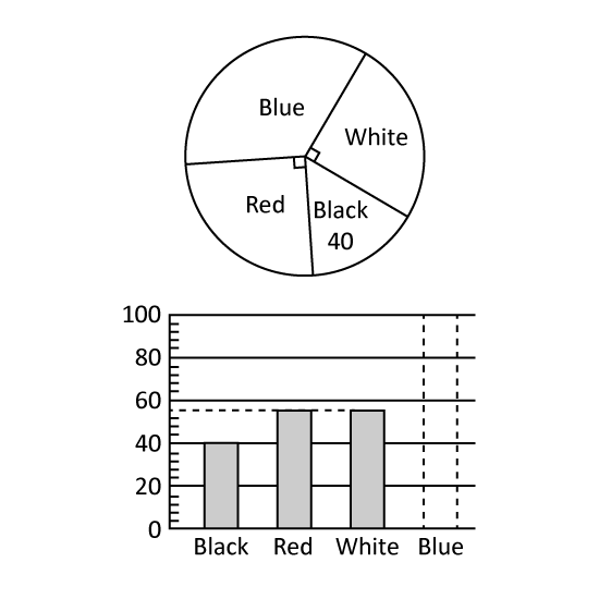
Image in this question is not available.
Level 1
Find the following values without a calculator.
- 13 x 360° = ______ °
- _____ x 360° = 90° (Give the answer in fraction.)
- 10% x 360° = _____ °
- ____% x 360° = 180° (Give the answer in fraction.)
2 m
Image in this question is not available.
Level 2 PSLE
A group of boys were asked to choose their favourite sport from swimming, basketball and football. The pie chart represents the boys choices. Half of the group chose football.
- What percentage of the group chose swimming?
- The boys' choices were also represented by a bar graph. Part of the graph had been torn off. How many boys chose basketball?
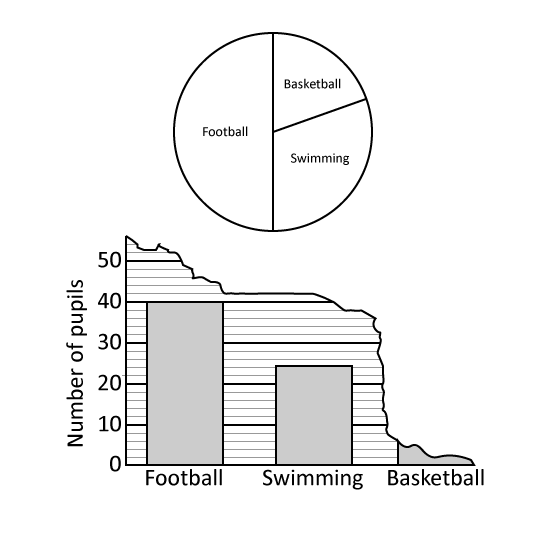
Image in this question is not available.
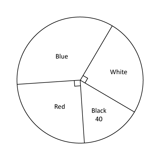
Level 1 PSLE
The pie chart represents the number of stationery sold by a shopkeeper. An equal number of markers and staplers were sold. What percentage of the stalks of flowers sold were markers?
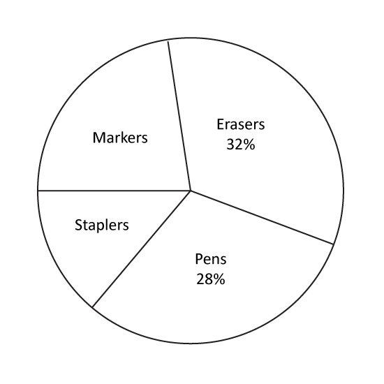
Level 1 PSLE
The pie chart represents the number of stationery sold by a shopkeeper. An equal number of markers and staplers were sold. What percentage of the stalks of flowers sold were markers?
Image in this question is not available.
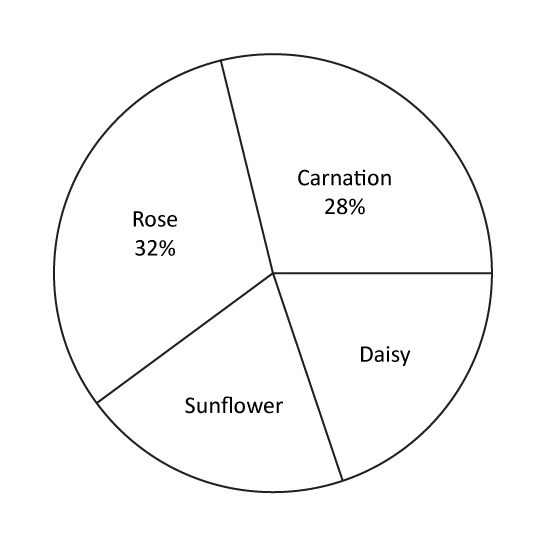
Level 1 PSLE
The pie chart represents the number of stalks of each type of flowers sold by a florist. An equal number of stalks of sunflowers and daisies were sold. The florist sold 6 more stalks of roses than carnations. What was the total number of stalks of flowers sold?
Level 1 PSLE
The pie chart represents the number of stalks of each type of flowers sold by a florist. An equal number of stalks of sunflowers and daisies were sold. The florist sold 6 more stalks of roses than carnations. What was the total number of stalks of flowers sold?
Image in this question is not available.
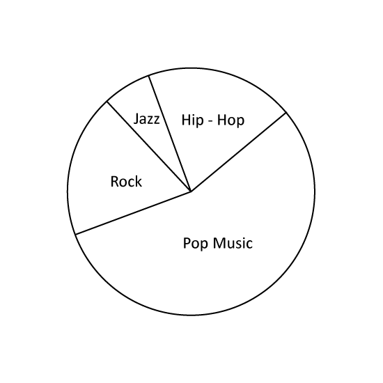
Level 2 PSLE
The pie chart shows the different genres of CDs at a stall. 15 of the CDs were Hip-Hop and 14 of the CDs were either Rock or Jazz. There were 3 times as many Rock CDs as Jazz CDs. What fraction of the CDs were Rock CDs?
Level 2 PSLE
The pie chart shows the different genres of CDs at a stall. 15 of the CDs were Hip-Hop and 14 of the CDs were either Rock or Jazz. There were 3 times as many Rock CDs as Jazz CDs. What fraction of the CDs were Rock CDs?
Image in this question is not available.
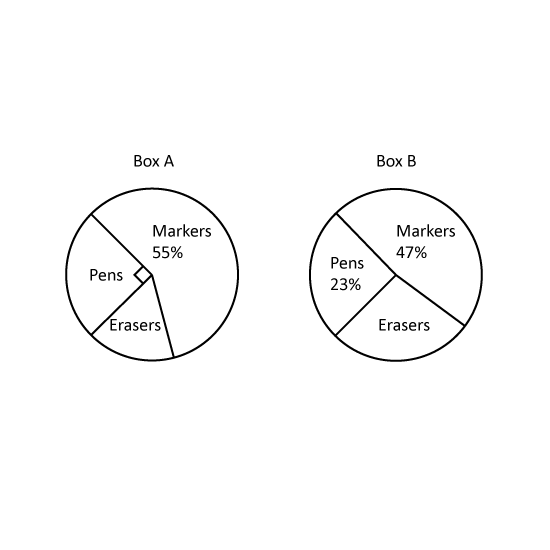
Level 2 The pie charts show the number of each type of stationery items in boxes, A and B. The total number of stationery items in Box A is twice the total number of stationery items in Box B.
- Find the percentage of erasers in Box A.
- What fraction of stationery items in Box B is erasers?
- The number of erasers in Box A is 40. Find the number of erasers in Box B.
Image in this question is not available.
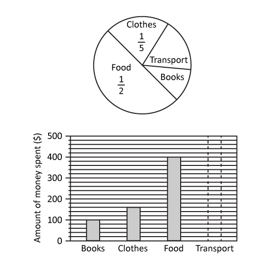
Level 2 PSLE
The pie chart shows how Zoe spent her money. The amount of money spent is also represented by the bar graph.
- What percentage of her money did Zoe spend on food?
- What fraction of her money did Zoe spend on books?
- How much of her money was spent on transport?
Level 2 PSLE
The pie chart shows how Zoe spent her money. The amount of money spent is also represented by the bar graph.
- What percentage of her money did Zoe spend on food?
- What fraction of her money did Zoe spend on books?
- How much of her money was spent on transport?
Image in this question is not available.